Photo101Weekend4: Colour vs Monochrome.

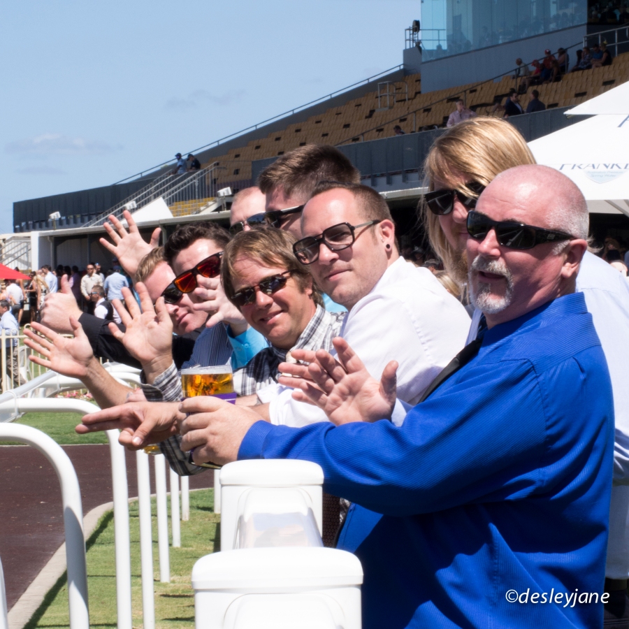
201411_Races-16Yesterday’s post with photos from our day at the races was mainly presented in black and white. It was suggested by @terryb that I show the colour versions as well and I thought it was a good idea. I was interested to see the comparison side-by-side. The races are such a colourful event, so it’s nice to see those colours. But I do like the nostalgia of black and white for these shots as well. I feel like there are less distractions in the black and white shots maybe?

What do you think works best?

x desleyjane


Posted

in

by

Comments

41 responses to “Photo101Weekend4: Colour vs Monochrome.”

  1. lrod1726 Avatar

    I like the black and white pictures better because they leave you wanting to know the story behind it. But overall, nice shots!

    Liked by 1 person

    1. desleyjane Avatar

      Thanks, me too. The black and white feels good ๐Ÿ™‚

      Liked by 1 person

  2. Amy Sampson Avatar

    Before photo 101, I was not a fan of black and white. I’ve changed my mind. I”m even using it myself, quite a bit, these days.

    Liked by 1 person

    1. desleyjane Avatar

      I love black and white, but I haven’t used it a lot. Yes, I’m definitely using it a lot more now ๐Ÿ˜‰

      Liked by 1 person

  3. nty6x Avatar

    black and white for the win! Especially ‘The Winner’ which makes it seems like you jumped back in time and caught a bit of history ๐Ÿ˜€

    Liked by 1 person

    1. desleyjane Avatar

      That’s exactly how I feel! A bit newspaper-y.

      Liked by 2 people

  4. Capt Jill Avatar

    I like most of them better in black and white, especially the last one. For some reason, I like the 2 with the horses better in color. I can’t really say why. They feel more ‘artsy’ maybe. They’re all good. ๐Ÿ™‚

    Liked by 1 person

    1. desleyjane Avatar

      Thanks Jill. It was a super colourful day ๐Ÿ˜‰

      Like

  5. dwaycrafts Avatar
    dwaycrafts

    I am torn I like the colors of the blue sky, the jockey’s, the greens. Then I see “Place your bets” I like the black and white. Pretty much, I don’t think you can lose either way. They all great shots.

    Liked by 1 person

    1. desleyjane Avatar

      Thanks so much. I’m glad we have both colour and mono!

      Liked by 1 person

  6. Hilary no tabi Avatar

    Definitely b&w. I think the best ones are the man and his tie and the oldtimers. Both don’t have too much going on and lots of contrast. I wonder what the horsey ones would be like from a lower angle?? The first one likely means the most to people who know the crew. ๐Ÿ™‚ I would prefer side profiles because then it wouldn’t matter that I don’t know them. Did you bet and win? ๐Ÿ˜€

    Liked by 1 person

    1. desleyjane Avatar

      Thank you! Yes I bet a total of $16 and took home $17.90 I’m a big spender LOL.

      Liked by 1 person

  7. graydaysandcoffee Avatar
    graydaysandcoffee

    I think the shots of the men are better in b&w. the horses though, i like in color better. they’re all good. what a great idea to take your camera to the track

    Liked by 1 person

    1. desleyjane Avatar

      Thanks. I think the horse and jockeys do suit colour but I am in love with b&w!!

      Liked by 1 person

  8. Cardinal Guzman Avatar

    For me B&W works best on these shots. LIke you mention, it’s less distractions and in this photo reportage the colours doesn’t add anything of value to the story.

    Liked by 1 person

    1. desleyjane Avatar

      Thanks Cardinal. For me, b&w as well ๐Ÿ˜„

      Like

  9. luciledegodoy Avatar

    I’m for the B&W version.It’s my preference for photos, at all times. But for me, the horse is better in color.

    Liked by 1 person

  10. nalinki Avatar

    I prefer the monochrome pictures for this series. the colors add to much agitation to the collection

    Liked by 1 person

    1. desleyjane Avatar

      Me too. Thanks for stopping by!

      Liked by 1 person

  11. estelea Avatar
    estelea

    B&W for me too! Although I love the last pict in colors. I guess the BW gives a feeling of stillness, helps focusing on the details and the atmosphere. Your post is really inspiring, will definitely try the comparisons of colors soon..

    Like

    1. desleyjane Avatar

      Thank you!
      “Focusing on the details and the atmosphere” – I like it.

      Liked by 1 person

  12. Michelleintel Avatar

    I agree with everyone else. The black and white could have easily been 1950. I love the feel of it. The colors were so vibrant. I would prefer those for scrapbook shots of a happy day at the races.

    Liked by 1 person

    1. desleyjane Avatar

      I just said to my dad today that it looks like a shot from the 50s ๐Ÿ˜„ It’s been fun and really interesting to compare them. Thanks Michelle.

      Liked by 1 person

  13. spugwash Avatar

    Oh dear. I prefer the colour. I love the full on colours of a race day it’s part of the excitement as buzz and usually helps me forget how much I lost on my chosen donkeys.

    Liked by 1 person

    1. desleyjane Avatar

      LOL! That’s good! Something for everyone!

      Liked by 1 person

  14. crisisalive Avatar
    crisisalive

    Just recently I have been comparing most of my photos as well. I have to say that b&w just adds a flare to some captures. It just makes you imagine more…

    Liked by 1 person

  15. eclecticoddsnsods Avatar

    you know i love black and white but it hink with animals the general rule of thumb for me personally is that i like to see them in colour, except for my dog who is black and white anyway. lol….great pics and very jealous of you at the races, mind you i get so nervous they will hurt themselves and come back with a lot more grey hairs than when i went x

    Like

  16. pommepal Avatar

    What a great idea to show the 2 comparisons side by side. Like every one else, I think the honours go to the B&W images…

    Liked by 1 person

    1. desleyjane Avatar

      It was @terryb’s idea ๐Ÿ˜„ I agree, I just love the b&w’s.

      Liked by 1 person

  17. Stacy P. Fischer Avatar

    I love the black and white versions, Desleyjane, especially Getting Late and Place Your Bets! The tones are just lovely. Great idea to post both treatments! What a fun day you had ๐Ÿ™‚

    Like

    1. desleyjane Avatar

      Thanks Stacy! Yep it was good fun ๐Ÿ˜„

      Like

  18. emmanique Avatar

    The black & white give them a timeless look the photos could have been taken last week, last year or 40 years ago. The coloured are good but……..prefer B&W

    Liked by 1 person

    1. desleyjane Avatar

      Thanks ๐Ÿ˜Š me too!

      Like

  19. Guilhem Ribart Avatar

    I prefer the coloured except the last one ๐Ÿ™‚

    Liked by 1 person

    1. desleyjane Avatar

      It’s funny, everyone is divided on this ๐Ÿ˜€

      Liked by 1 person

      1. Guilhem Ribart Avatar

        That’s because Photography is an Art ๐Ÿ™‚

        Like

        1. desleyjane Avatar

          Very true!! My favourite is the one called Winner and I LOVE it in b&w. For some reason, I’m very attached to that photo.

          Liked by 1 person

          1. Guilhem Ribart Avatar

            Coloured or BW, composition of all your photos are great!! That’s a good work!

            Liked by 1 person

            1. desleyjane Avatar

              Aww thank you so much ๐Ÿ˜‰

              Liked by 1 person

I’d love to hear from you!