It’s time again for Stacy’s One Photo Focus, where we are given a photo to edit as we see fit. I’m always astounded at the variety of creativity that we find from the entries. Click on the link above to see all of the other submissions.
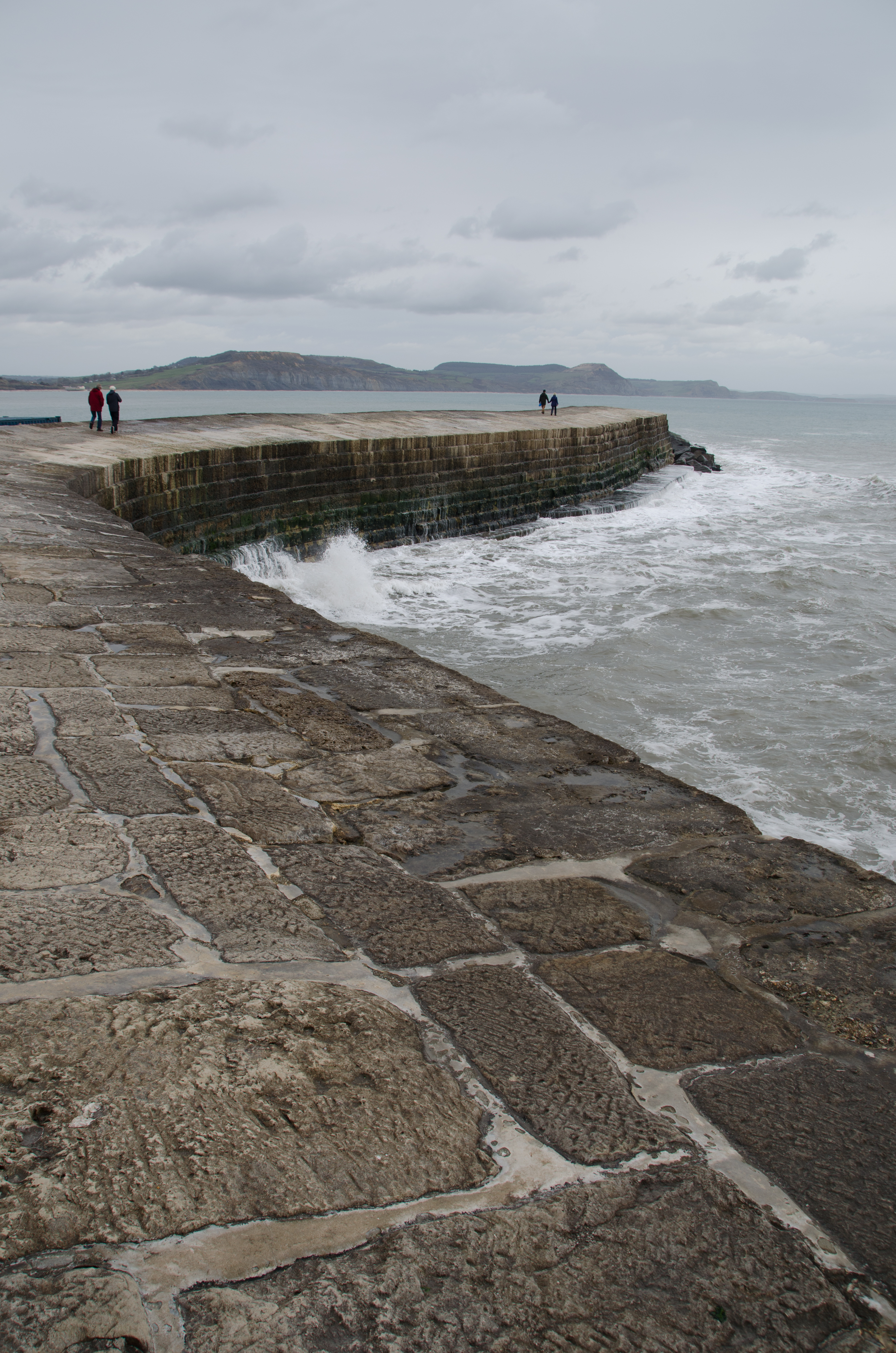
Here is August’s original image, supplied by Katie Prior. What a great scene! Those waves crashing, the texture in the pier and those clouds overhead. I really couldn’t wait to get started.
Here is my dramatic black and white version:
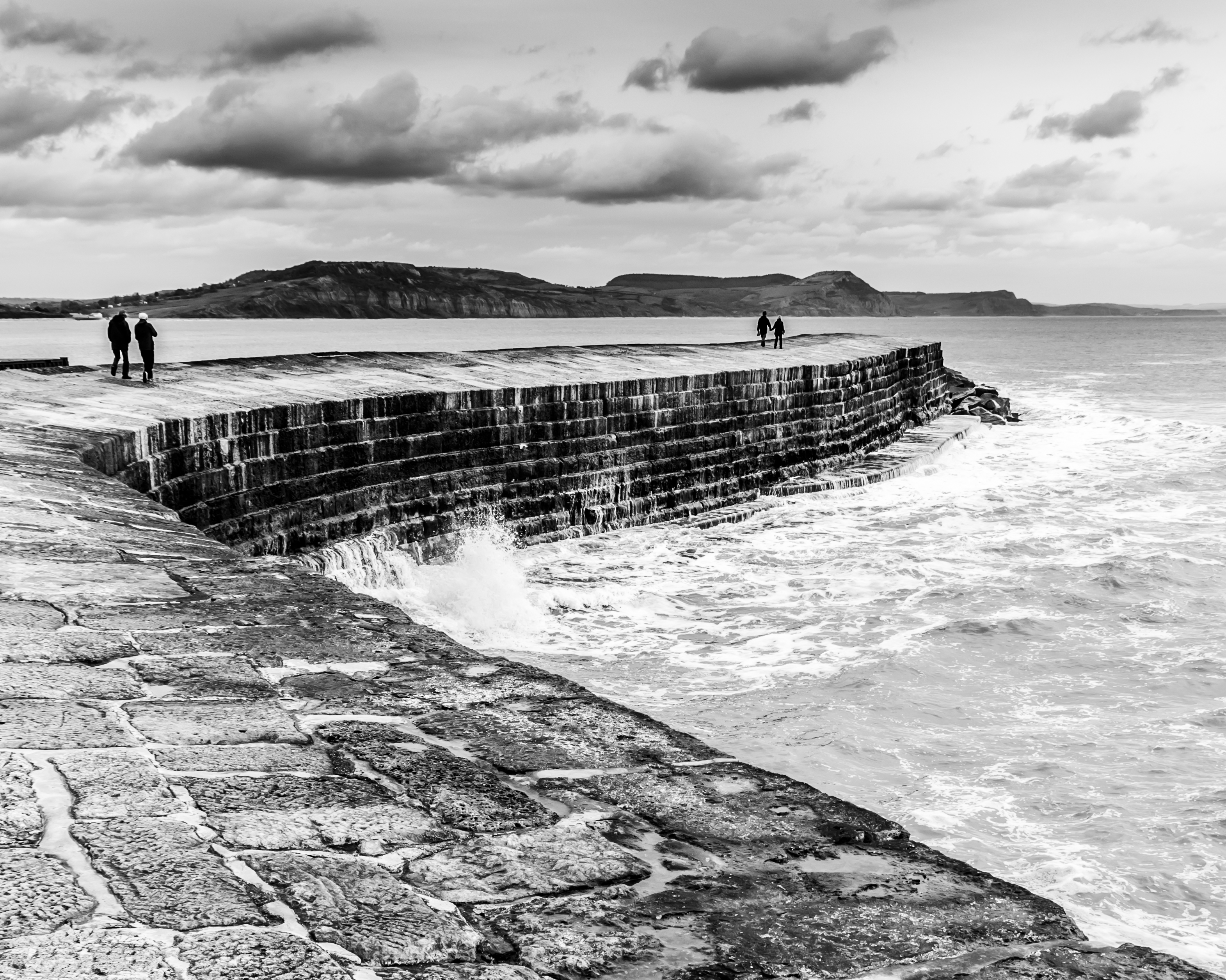
I felt that the composition lent itself nicely to a square crop. It enabled me to get the bottom right edge of the photo to meet that rough and rocky pier. I think it really highlights the crashing waves. I also used a graduated filter to darken those clouds, enhancing the stormy mood of the shot.
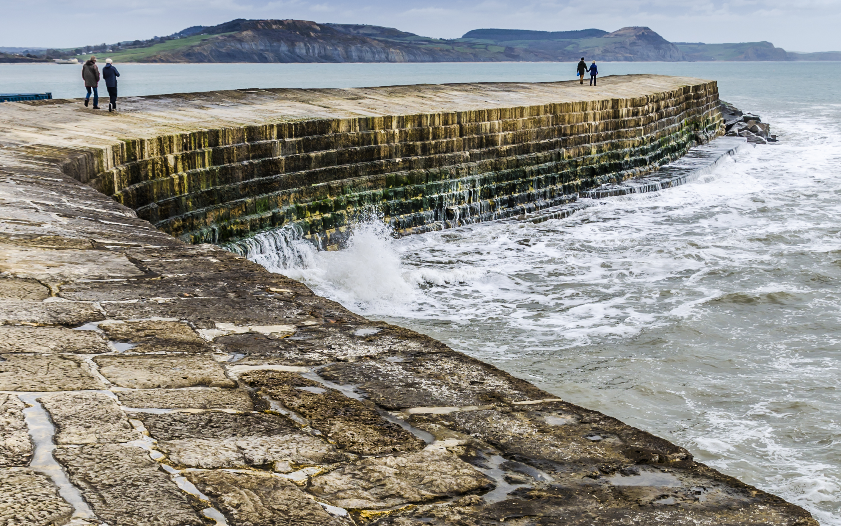
Of course, I had to have another try. I wanted to do another edit with a more traditional crop and also in colour. I wanted to see what was hiding in the side of the pier where the waves are crashing in and boy was I happy with the gorgeous colours that emerged. I haven’t adjusted the colours at all, except for desaturating the red coat that the person on the left is wearing as it distracted from the gorgeous greens, golds and blues. The colours were only enhanced by increasing overall contrast and clarity in the basic section of Lightroom.
Absolutely a fabulous challenge to sink your teeth into. I highly recommend it. Thank you Katie for a wonderful shot and thank you Stacy for organising. This is fun!
x desleyjane
Nice remake Desley.
LikeLiked by 1 person
Thank you dear CG 🙂
LikeLike
Nice idea to crop square.
LikeLiked by 1 person
Thank you.
LikeLike
I like them both. Great edits.
LikeLiked by 1 person
Thank you Mary!!
LikeLike
This turned out real well in black and white. I like your crop. 😀
LikeLiked by 1 person
Thanks so much Cee!
LikeLike
I like both, wonderful process! 🙂
LikeLiked by 1 person
Thanks Amy!
LikeLike
the black and white one is a stunning remake!
LikeLiked by 1 person
Ah thanks Nalinki, I think it’s my favourite too.
LikeLiked by 1 person
Great job, DJ. Obviously I love the drama the most but both are wonderfully done. No surprise. You’re a ninja! Xxx
LikeLiked by 1 person
Thanks my love and co-drama-queen x.
LikeLike
Why thank you!
LikeLiked by 1 person
I much prefer the first crop, the second one leaves no room for the top of the image to breathe in my opinion and I LOVE your BW conversion, esp the deep contrast on the stones in the foreground and the dark wall vs the waves.
LikeLiked by 1 person
Yah I think the second one was a bit harsh, I agree. But I do love the b&w 😄
LikeLike
Great job, especially with the black and white. Crop works better and monochrome works really well.
LikeLiked by 1 person
Thanks so much!!!
LikeLiked by 1 person
I really enjoyed both editions Desley 😃
LikeLiked by 1 person
Thank you Robyn 🙂 It’s a fun challenge!
LikeLiked by 1 person
It really is 😃😃
LikeLiked by 1 person
The first crop leaving the sky in gives more balance and I love the B&W, very dramatic. btw Thank you for putting me on to LR I’m having a lot of fun with it, much better and easier to use than PS
LikeLiked by 1 person
Oh I’m so glad to hear they!
Yes, in hindsight the second crop is a little too tight. Thanks PP 😀
LikeLiked by 1 person
Nicely done on the monochrome, Desley. Wonderful, moody sky adds to the overall drama of the scene and I really like the square crop! I do love the colors of the second, but miss that awesome sky. I love that you usually submit a few versions – always interesting to see what you come up with. It’s like a mini One-Four Challenge a la Robyn G 🙂
LikeLiked by 1 person
Thanks Stacy – yes that second crop is too harsh, but I do love the mono one. I’ve been thinking about joining the one-four…..
LikeLiked by 1 person
Oh, you should, Desley! Such a great challenge!
LikeLiked by 1 person
I also was captivated by the rich colours that emerged but your b/w is interesting too – it lends a whole different feel to the image.
LikeLiked by 1 person
Thanks Lynne, much appreciated.
LikeLike
Great job, Desly. Love the contrast in your black and white and how you emphasized the clouds. The One Four challenge is fun. Give it a try some time!
LikeLiked by 1 person
Thanks Emilio, I will definitely do that!
LikeLike
The crop has done a lot to reduce the tension which is increased again by the black and white processing. Very nice editing.
LikeLiked by 1 person
Thanks Ben – I enjoyed this one. Looking forward to yours next month!
LikeLike
Really cool edit, love the black and white and good idea to crop square. The colours on the second edit are really nice too, lovely and rich and I like that you changed the red coat green, it stops it from taking over so much. Nice work Desley!
LikeLiked by 1 person
Thanks so much Katie – it’s such a wonderful shot!
LikeLike
Thanks Desley, it’s nice to see so many great edits of it. 🙂
LikeLiked by 1 person
very clever crop, makes such a difference x
LikeLiked by 1 person
Aahhh thank you. I really like the square b&w. X
LikeLiked by 1 person