Last week, I posted some cute edits of a letterbox against a brick wall.
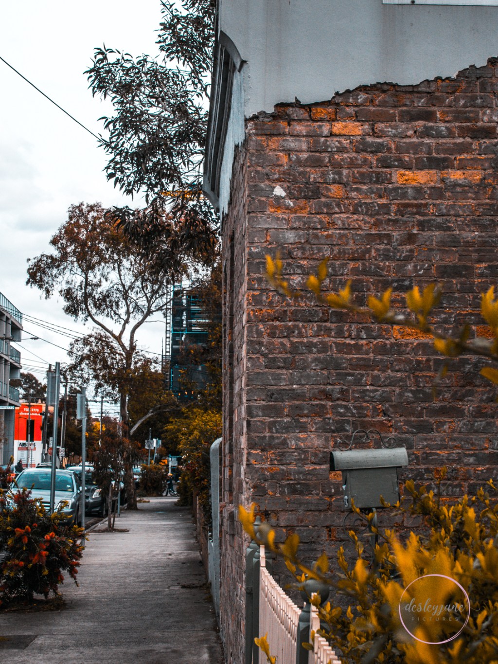
Here is the same wall and letterbox, but taken from a much wider angle. The day was missing any definition in the sky unfortunately.
I decided to give it a treatment similar to the letterbox with different presets.
Here is the original photo, edited how I usually would, and also in black and white.


It’s lacking something for me in black and white. Which is unusual, because I usually love buildings in mono. I do love the “ripped paper” feel at the top of the building though, it’s very cool.
So, on to my presets.


It wasn’t until this last autumnal-feeling shot that I noticed the little kid on a bicycle at the far end of the pavement.
What do you think about these presets?
x desleyjane

I’d love to hear from you!