One Letterbox, Three (Four) Ways.

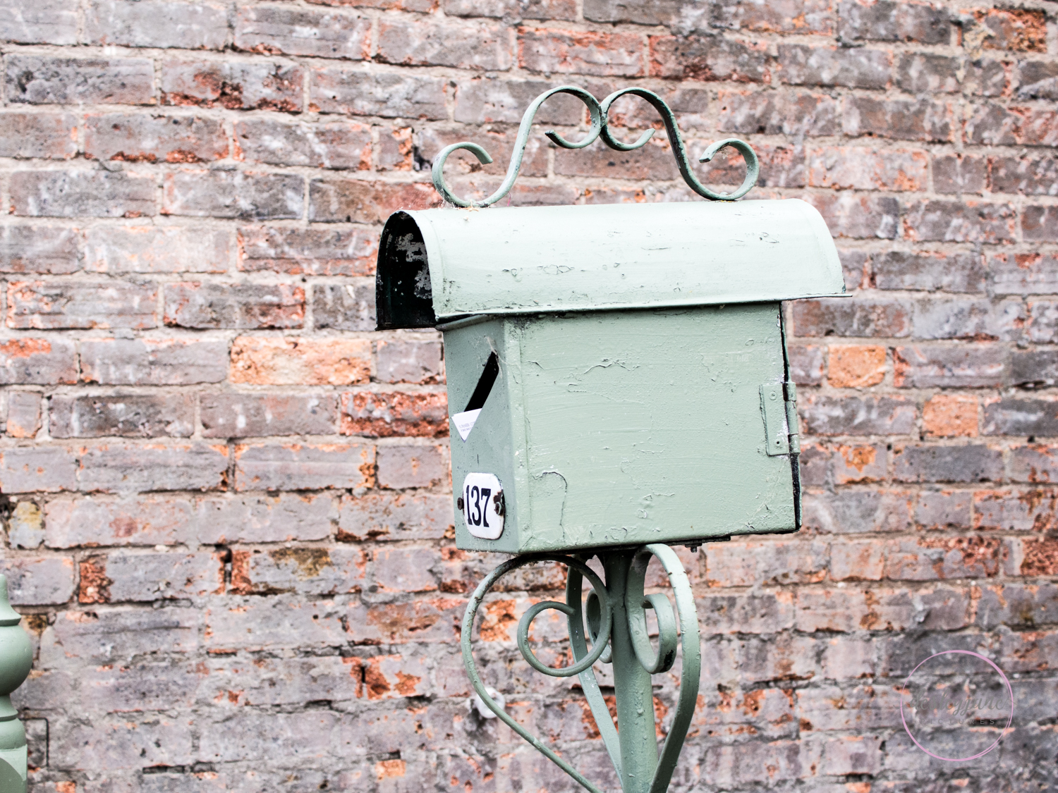
And now for something completely different. I’ve been playing with some new Lightroom Presets. I’ve had them for a little while but haven’t used them before.

Here is the original photo, edited how I would usually edit it:

LetterboxThreeWays-1

Although, this is a photo that I would probably edit in black and white usually, so:

LetterBoxThreeWays-4

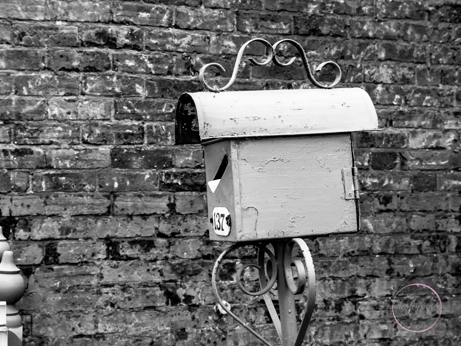
I find that it doesn’t have a lot of depth or contrast even, in black and white. I’m not sure, I don’t like the black and white very much, so I decided to try some presets.

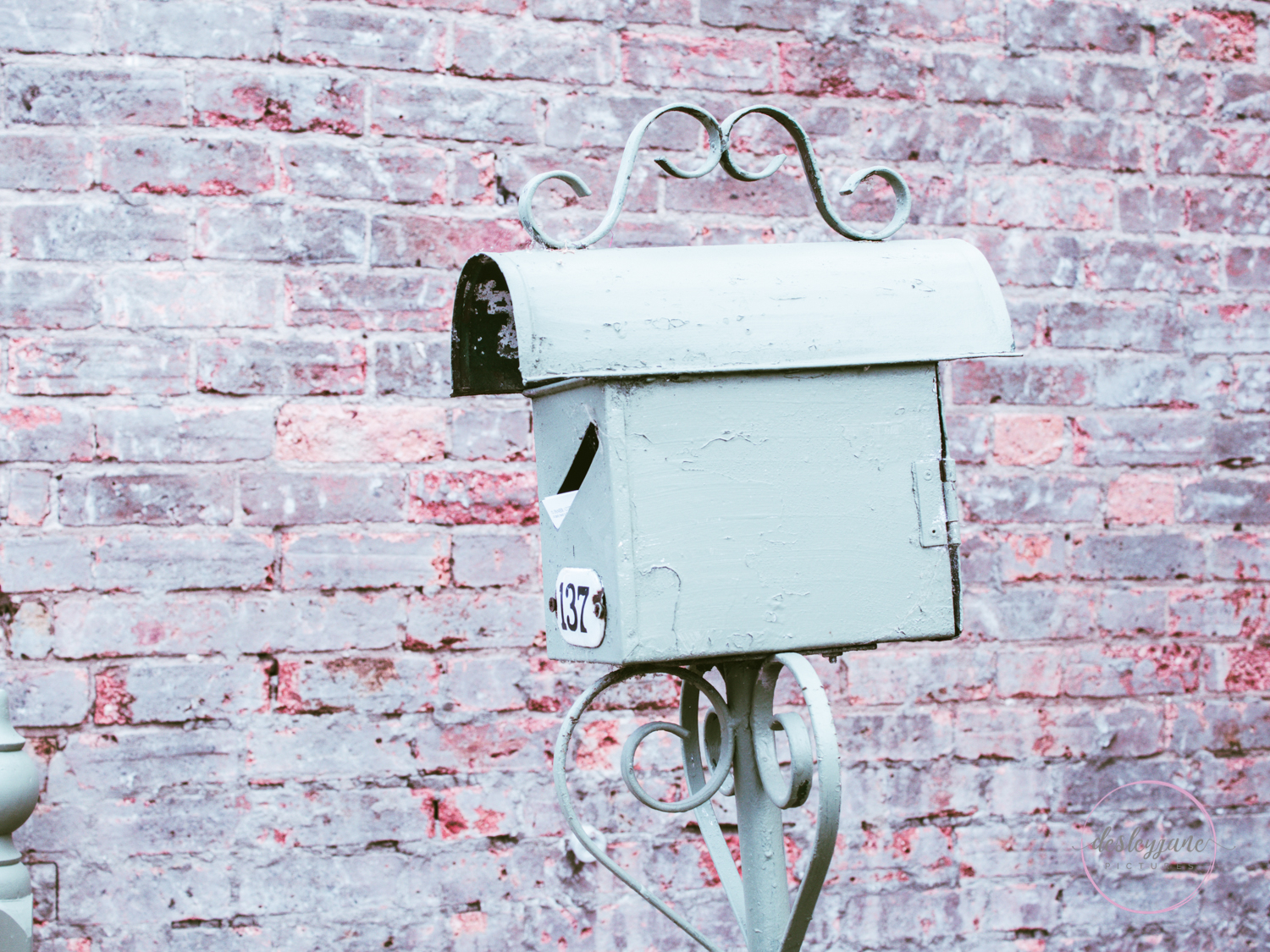
And then the fun begins. I feel like this edit has an early 20th century feel to it.

LetterboxThreeWays-2

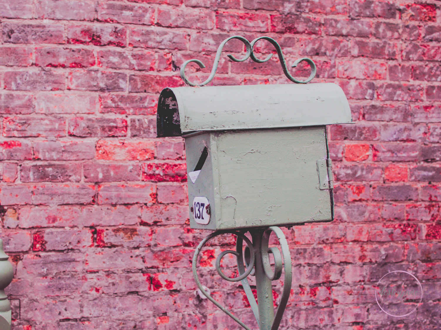
And my favourite edit:

LetterboxThreeWays-3

What are your thoughts? Which one is your favourite?

Anyone want to join me in this? #OnePhotoThreeWays. 

x desleyjane

Comments

12 responses to “One Letterbox, Three (Four) Ways.”

  1. Julz.......artist, blogger, photographer, graphic designer Avatar

    Interesting subject and treatment, I love the one with the pop of red too, seems to more contrast. Which Lightroom Presets are they? Something you created, purchased or freebies? I seem to collect them and have some many, but I invariably fall back on a few old favorites

    Like

  2. LdG luciledegodoy Avatar

    Even I go pink with you! That’s a very nice preset. I love it.

    Like

  3. Robert Avatar

    The red rocks!

    Like

  4. Heyjude Avatar

    I actually prefer the black and white version – more contrast.

    Like

  5. Jane Lurie Avatar

    HI Desleyjane- I’m with Jude– the B&W, but the faded first is nice, too. I have so many LR presets and like you, don’t use them much. I usually go to Nik first and I am trying Luminar out a bit, too.

    Like

  6. kayrpea61 Avatar

    Another vote for the B&W, Desleyjane, but the last is quite stunning in a way. Cheers, Ken

    Like

  7. morselsandscraps Avatar

    Decisions, decisions! The first one would be my preference, if I wasn’t a Scorpio. Since I am, your favourite is mine.

    Like

  8. Su Leslie Avatar

    I actually like number three the best. I like the simplicity of the colour palette.

    Like

  9. Laura Bloomsbury Avatar
    Laura Bloomsbury

    #3 for me – love the faded 1950s colouration as I must have seen the world then!

    Like

  10. Amy Sampson Avatar

    I like the second last one best. 🙂

    Liked by 1 person

    1. desleyjane Avatar

      😊😊 thanks Amy. I’m fond of that one too.

      Liked by 1 person

  11. One Wall, Three (Four) Ways. Avatar

    […] Last week, I posted some cute edits of a letterbox against a  brick wall. […]

    Like

I’d love to hear from you!